RapaQ online shopping platform
Enhancing the shopping experience
Overview
During my tenure at RapaQ, an e-commerce company, we encountered the challenge of boosting the average purchase value on our platform. As part of my role, I was tasked with identifying specific issues within the existing system and proposing effective solutions by means of a website redesign.
Role
UI/UX Designer
Timeline
July 2018 - Feb 2019
Responsibility/ Mission
Streamlined checkout processes
Redesigned the interfaces
Final outcome
Success in Grab Customer Insights
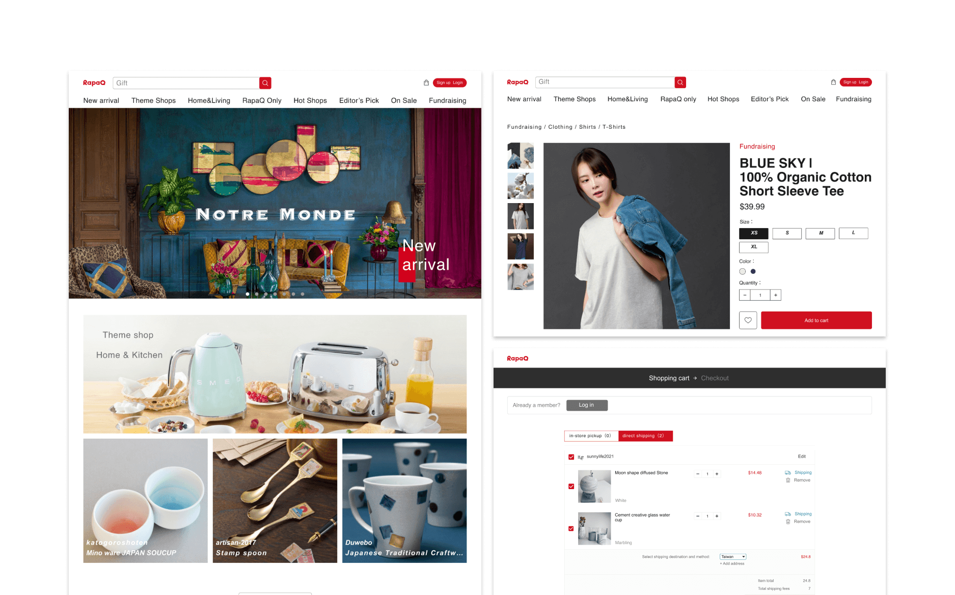
I redesigned the homepage, product page and the shopping cart page to optimize the online shopping experience. Overall, the design helps our company increase the purchase rate and membership.
10%+ Purchase rate
20%+ Member growth
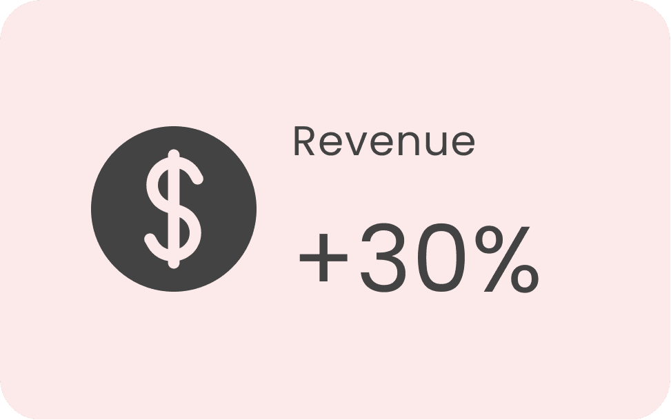
However, our revenue has not increased as our expectation. From our customers, we've learned that they may not return to our platform and we need to adjust our design in the future to meet our goals.
ChallengeC
Our Company Suffer from Low Revenue
The marketing team pointed out current online platform did not provide good shopping experience and caused the low purchase rate. My team analyzed the main issues below:
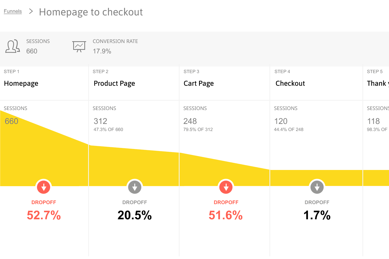
Low Completion Purchase Rate
Our team used Funnel analysis to analyze the customers’ path and found 50% online shoppers abandon items in their shopping cart.
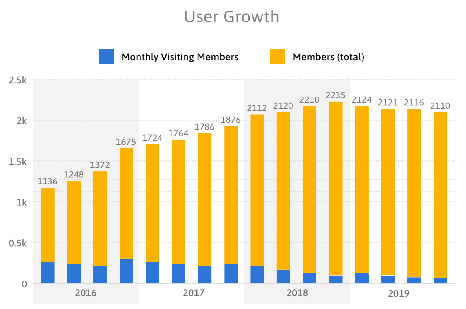
Slower Membership Growth
According to our backend data, we noticed the member amount grow slowly as well as the visiting rate.
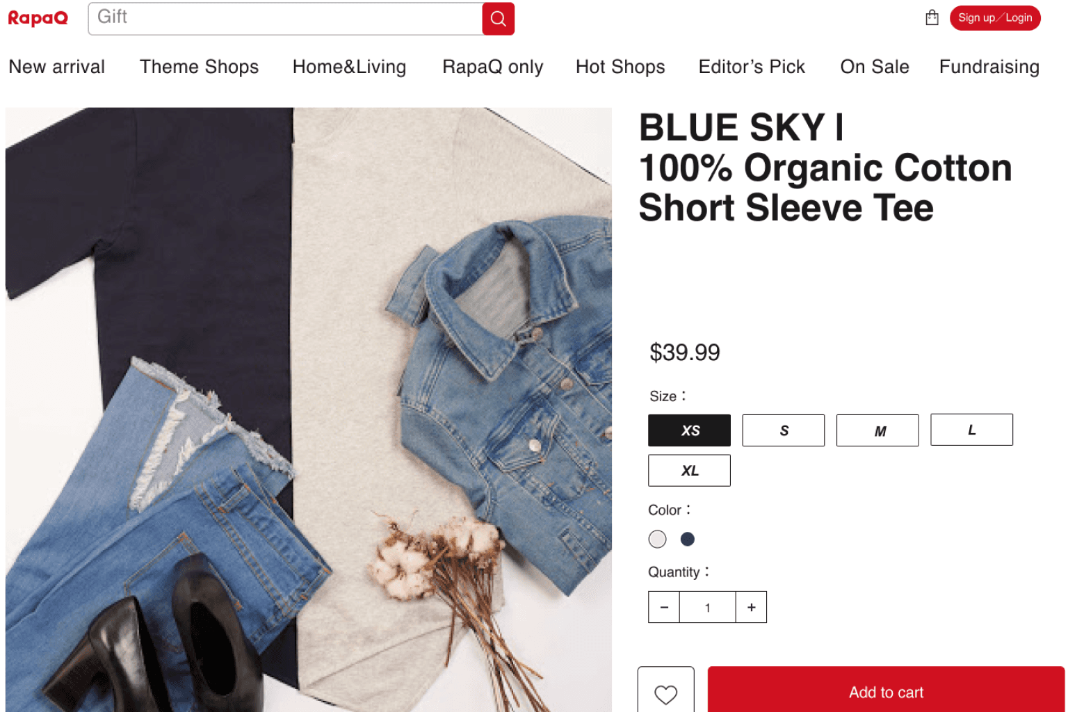
Insufficient Product Information
Customer feedback highlights the inadequacy of product details on our platform, affecting their purchase decisions.
Research
Understand the Stakeholders' Concern
I conducted an interview by interviewing most relevant stakeholder and collected data through observing their behavior and asking their thoughts and feelings to figure out their pain points.
Interview selected

Observe customer behavior and create journey map
During interviews, I assigned a task for participants to buy a gift while speaking their actions aloud. I observed that they became confused while viewing product information and found the checkout process redundant.
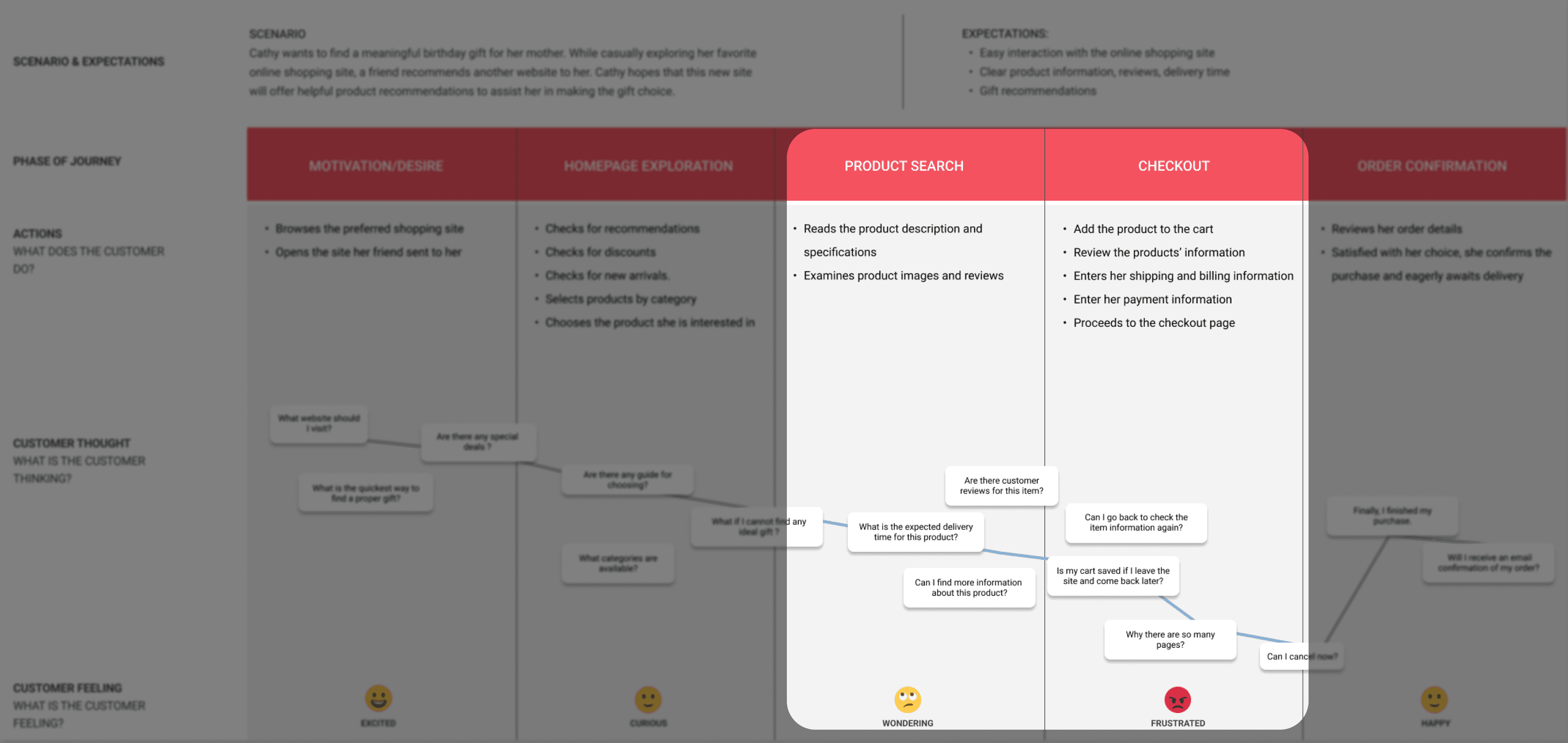
Pain points
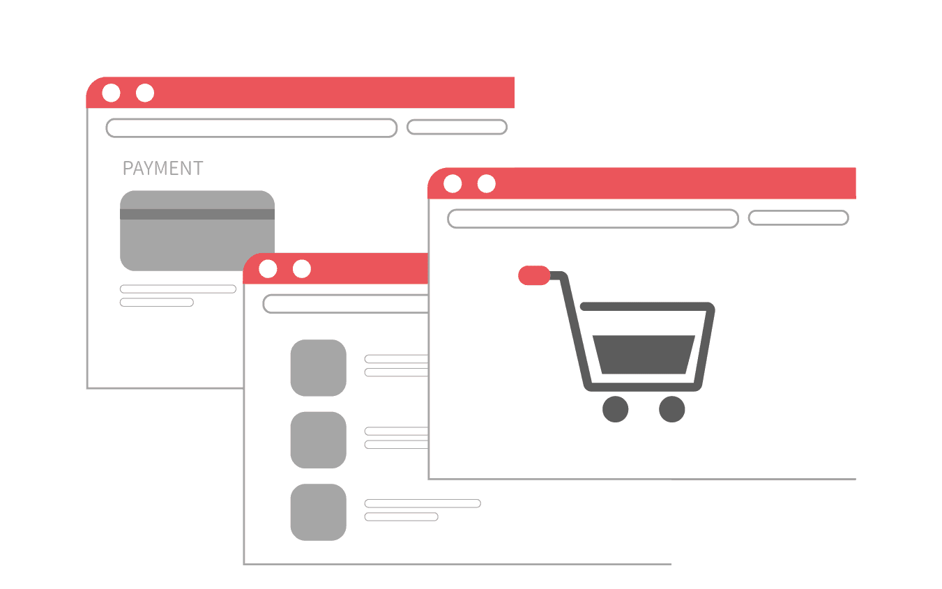
Cumbersome Shopping Cart
Too many pages in shopping journey which makes customers lost their patient.
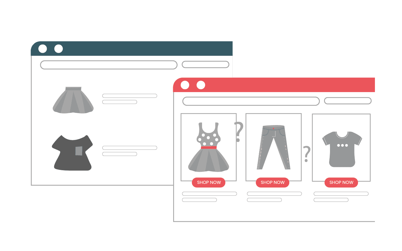
Unclear Business Value
Visitors to our website do not notice the differences and choose the site they used to visit.
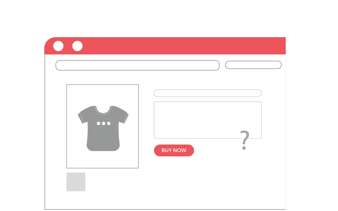
Unclear Product Information
The product page lacked essential information, leading to customer confusion and reduced purchase interest.
Refine
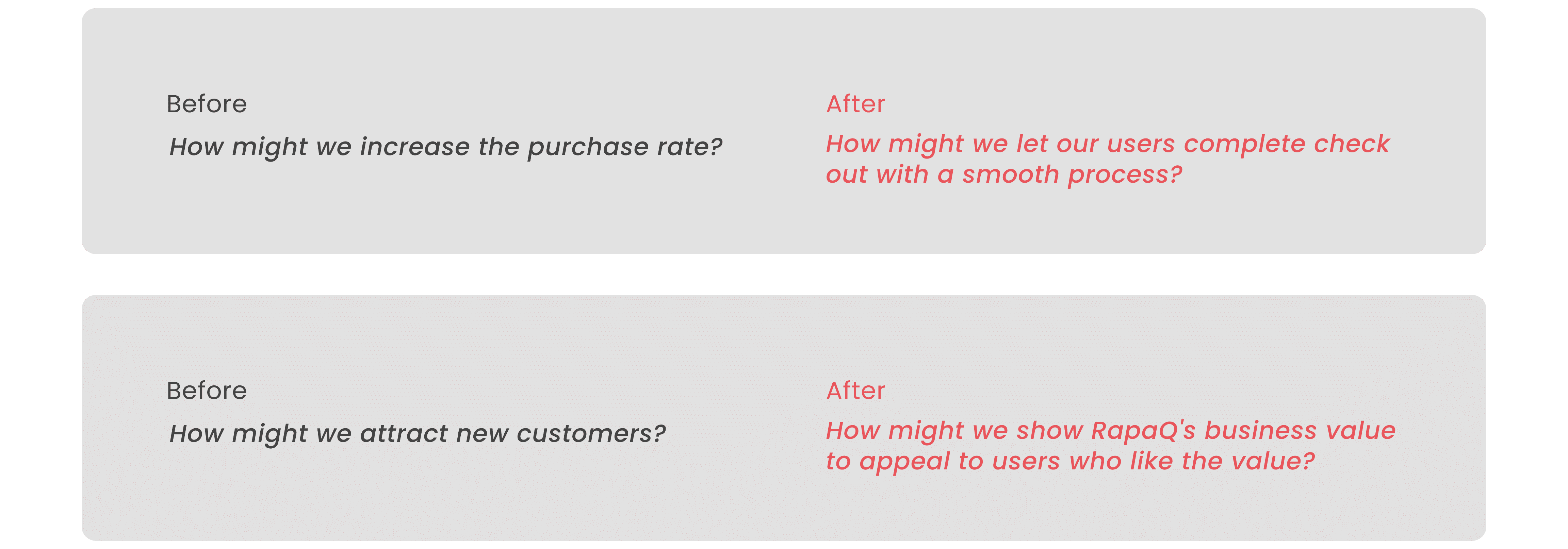
Reframe the Problem Statement to HMW
I believed having a good question can lead to better solutions. Thus, we narrowed down the statement each time getting a new insights. The end result was two refined problem statements for designing our solutions.
Design solutions
Crafting Four Ideas to Meet the Needs
I conducted an idea session with my teammates to confirm our design direction. In my design solution, I focused on three critical aspects: embody our business values, enhance the user experience, and address the current interface problems by reflecting them on the website.
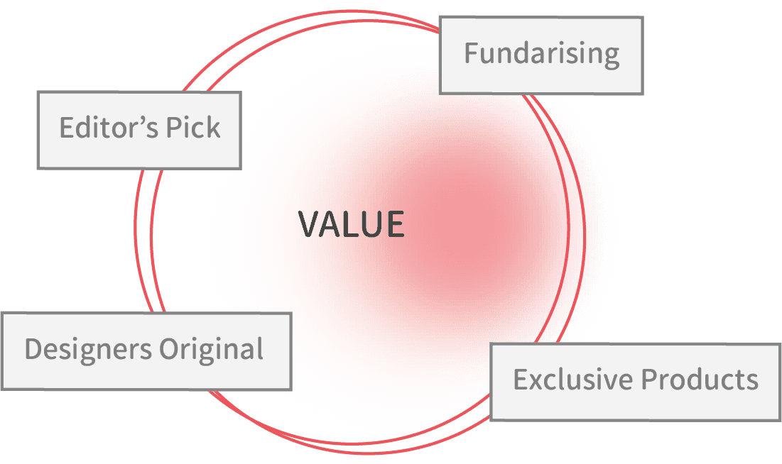
1. Business Value-Driven Navigation Bar Redesign
I identified an opportunity to enhance our navigation bar and showcase our store's unique features. To kickstart this process, the team defined our business values.

2. Homepage Optimization for Clarity and Product Access
Improving the information architecture of our homepage to make it more user-friendly, ensuring easy access to a wider range of products.

3. Redesign the Check Out Process
Before, customers navigated through multiple steps – from reviewing their cart to the payment page, and finally, a redundant review. Now, We've restructured the checkout experience, starting with reviewing your products in the cart, seamlessly transitioning to the payment page, and concluding with a single review step. This redesign simplifies and speeds up the shopping journey.

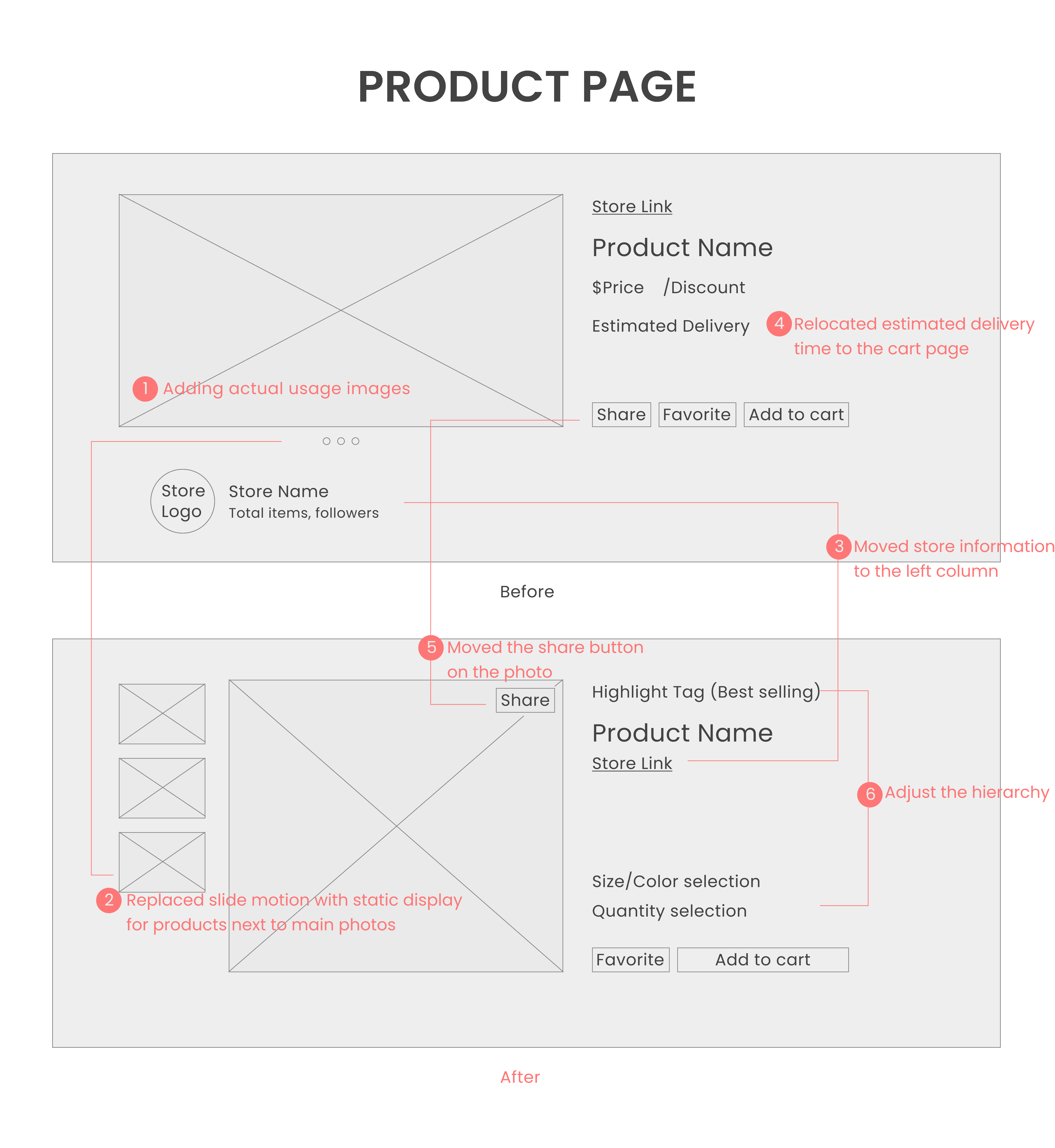
Redesign Product Pages
I rearranged the product page for better organization. The goal was to make it easier for users to access product information and highlight key features to boost sales.
Testing
Collecting User Feedback
We collected the feedbacks through online questionnaire to do the test. We also checked the backend to know what changes after we our new design. I tested the previous interviewees to get more insights through qualitative research.
How did I Do
Complete purchasing observation through backend
Conduct 10 interviews
Online forum survey
Results
15%+ users complete their shopping items.
95% users thought our products are unique so they are willing to shop on our platform.
Participants' feedback
Considering others' purchase lists on shopping
Customers report that they are more likely to buy if they can see what others are interesting in.

Clear business values can make a brand more trustworthy
Participants think our business value can satisfy their expectation so they are willing to become members.

Enhancing product trust through actual usage photos
User testing uncovered that actual product photos significantly enhance user understanding, a pivotal factor in their purchasing decisions.
Results & Impact
Achievement
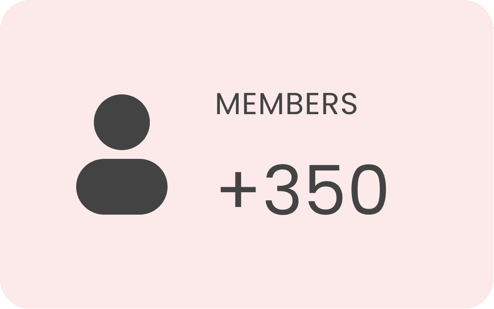
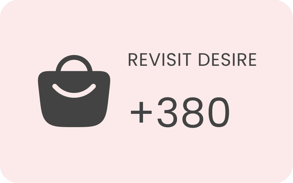
Our member grows 0.8k, and the user view amount grows 3k. 0.5k users are willing to shop again on out platform.

Impact
Strategic impact
Product strategy driven by research insights.
Product impact
Through collaboration, my team were able to quickly relay feedback from research and incorporate it to the prototype - Agile!
Stakeholder collaboration impact
UXR became a strategic partner of our product team.
Opportunity
Room for improvement
Develop the application
The development of apps is expected to attract more consumers in the era of convenience and speed, so this will be our next stage.
Don't spend too much time referring to other shopping platforms
I didn't have any experience in e-commerce before this project, so I spent a lot of time researching relevant platforms. Since I didn't have a clear design direction and goal, I was hesitant to start because I hadn't finished absorbing reference materials.
Synchronize cross-departmental information
